Paradox Merch:
take a piece of the festival home.
A storefront for what you wear and what you do.
Merchandise, festival experiences, and one shared cart.
Be part of the experience.
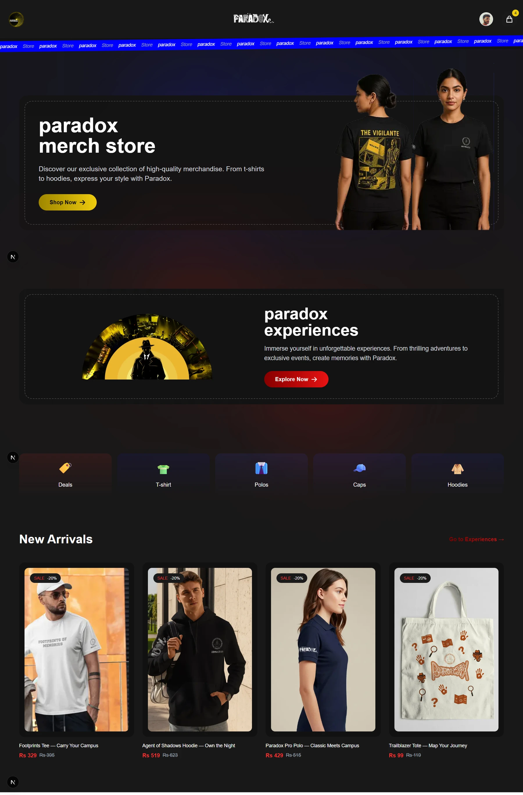
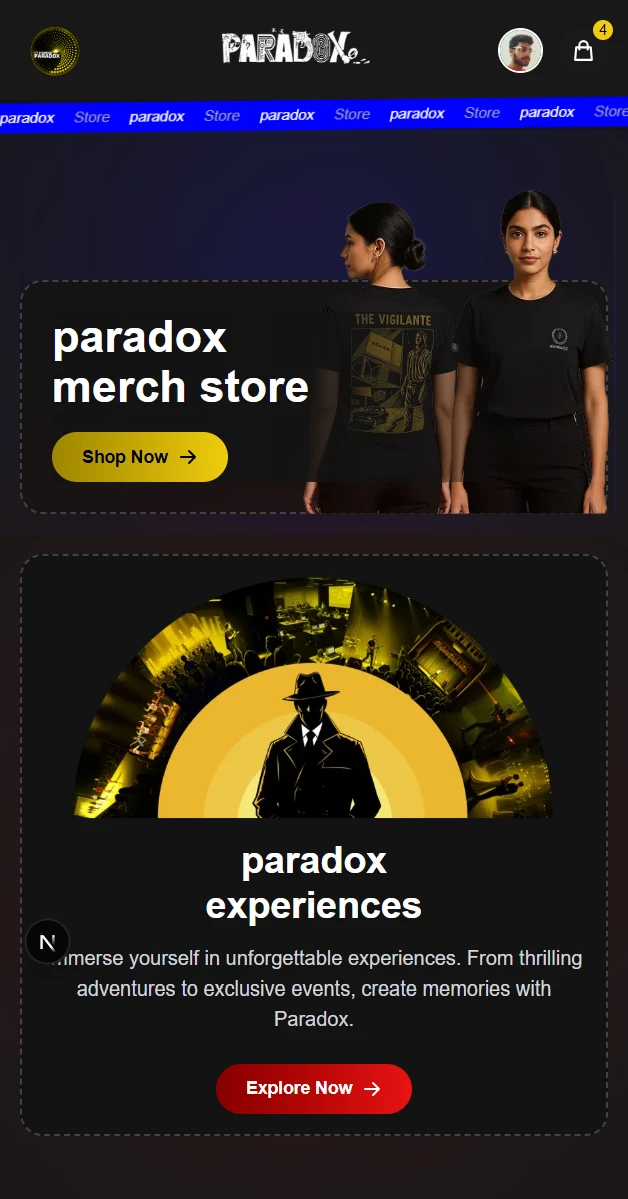
A festival is something you experience, and something you remember. Paradox Merch brings those two sides together: the hoodie you take home, the activity you book with friends, and the small decisions that make each purchase yours.
The project pairs a distinctive storefront with product variants, image galleries, experience time selection, and a cart that understands both physical goods and timed activities. This is a closer look at the interface and the engineering behind that journey.
- The project
- Festival commerce · Web experience
- The collaboration
- Sales & Merch team, tech leads,
and department stakeholders - Built with
- Next.js 15 · Tailwind CSS 4
Apollo GraphQL · Firebase
Two ways to join in.
One place to start.
Merchandise and experiences ask different questions. A T-shirt needs a size and an image that shows the design. Laser tag needs a day, a time, and enough context to plan around it.
The storefront gives each journey its own entry point while connecting them through the same cart. Visitors can move between shopping and experiences without losing the choices they have already made.
Discover the festival.
Lead with the event’s visual identity and clear paths into the collection and activities.
Choose the details.
Make size, product view, day, and time part of the selection before adding an item.
Keep it together.
Bring products and experiences into a common cart with the details needed to tell them apart.
Festival energy.
A familiar shopping rhythm.
The original interface uses charcoal surfaces, bold photography, and bright actions. A repeating blue brand strip gives the page a recognisable event identity; rounded panels and product cards organise the content beneath it.
Yellow carries merchandise actions and selected controls. Red marks the experiences entry point. Large product photography makes the collection the focus, with prices and choices placed close to the item.
Dark canvas.
Bright decisions.
Photography leads.
The next action stays visible.
Separate entry points
Merch and experiences have their own hero actions and can be reached from each other’s listing.
Images before detail
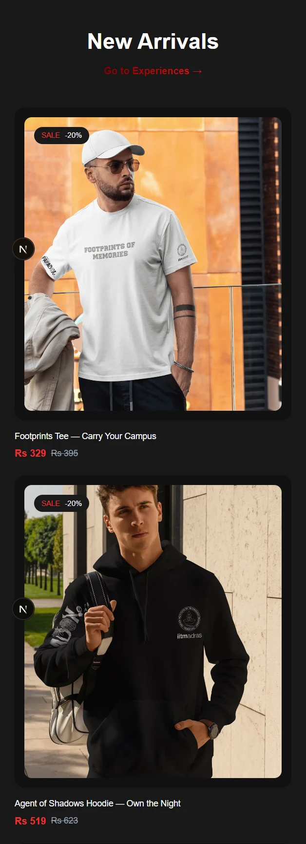
A large preview and alternate views let visitors inspect the design before choosing their size.
A layout for the device
Desktop detail pages use two columns. On mobile, the preview and thumbnails move above the product choices.
From a first look
to a personal choice.
The homepage’s new arrivals are fetched through GraphQL and filtered to merchandise. Product pages expand that record into a gallery, description, price, and the available size variants.
Selecting a size is required before adding a product to the cart. The selected variant’s ID travels with the product when the application sends a cart mutation to the backend.
The cart keeps the choice attached.
The cart models merchandise and experiences as different item types. A product is distinguished by its ID and size; an experience is distinguished by its ID and start time. Adding another item with the same combination increases its quantity.
Quantity controls, removal, and a running subtotal sit alongside the collection preference. Pickup is the default; choosing home delivery reveals the address form.
A booking starts
with a plan for the day.
Laser tag and LinkedIn headshots open a time-selection sheet. Day controls narrow the date, time windows group the available choices, and a specific slot enables the confirmation action.
Changing the day or time window resets the selection. Once confirmed, the chosen date and time are attached to the experience in the cart, and the visitor moves to the cart to review it.
Choose a day
Start with the event date
Choose a time
Pick a window and slot
Confirm
Attach the selected time
Review
Continue to the shared cart
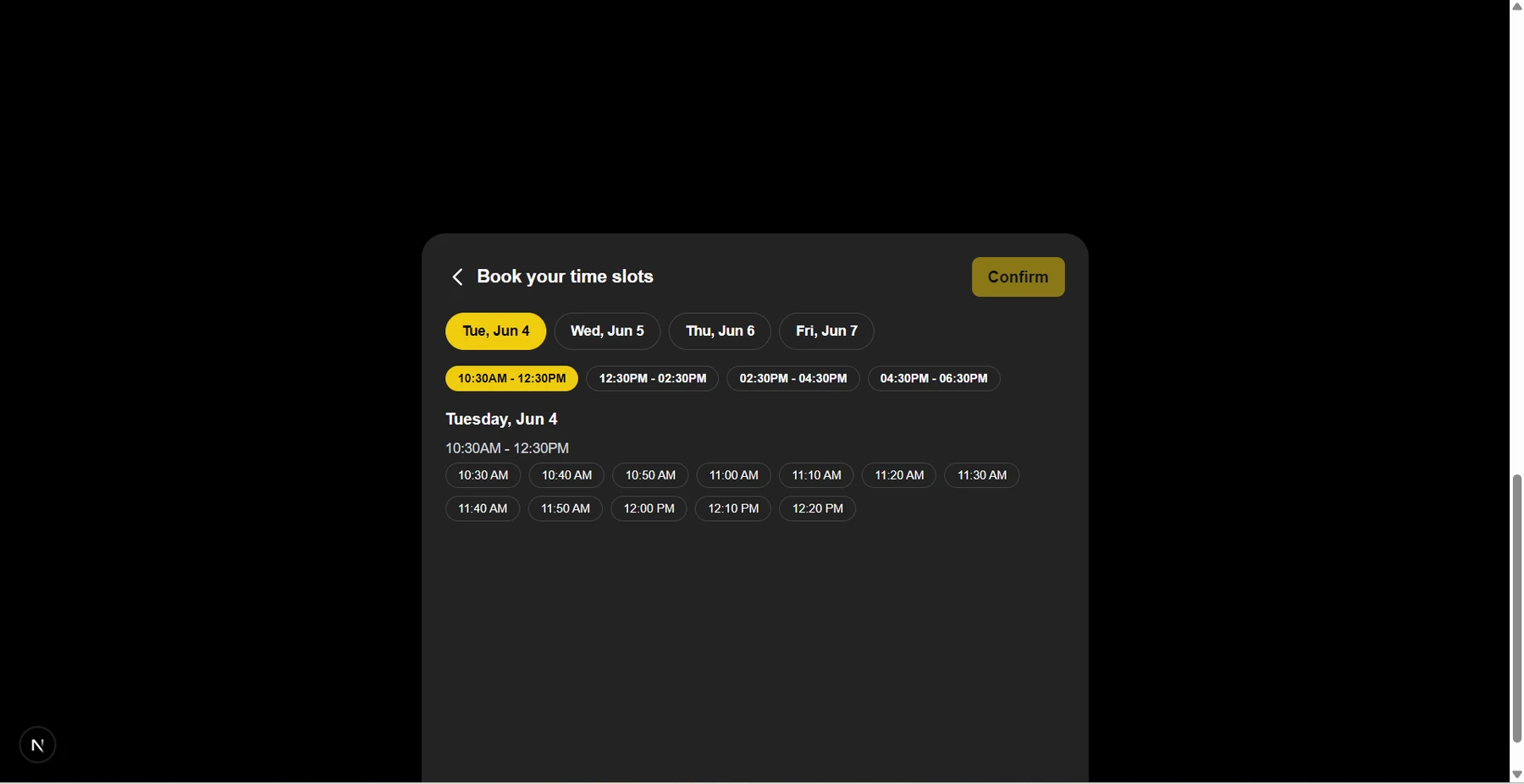
Selection and reservation are separate steps.
The published frontend generates the slot choices locally and stores the chosen time in the cart. Server-side capacity checks and reservation confirmation are a further integration boundary; the public code does not establish an overbooking guarantee.
A responsive storefront
over a typed product model.
The frontend uses Next.js 15’s Pages Router, React, and Tailwind CSS 4. Apollo Client connects catalog queries and cart mutations to the GraphQL service, described in the README as a Go backend. Generated GraphQL types define the product records used by the interface.
Go + GraphQL backend: documented external service. This repository contains the web frontend.
Catalog data becomes a product page.
Product paths are generated from catalog IDs. The detail page uses static data fetching with blocking fallback for additional products, then lets the visitor switch images and select a variant in the browser.
Identity connects to the commerce service.
Google sign-in runs through Firebase. The application exchanges the Firebase ID token through a GraphQL login mutation and receives a backend token and member record. Authenticated product additions can then include the member ID and selected variant.
The cart responds locally.
React Context updates the cart immediately and persists its contents in browser storage. Product additions can also call the backend mutation; experience selections remain local in the reviewed frontend.
Explore the implementation Catalog, variants, booking & cart state
A festival identity.
A connected shopping journey.
The result is a merch and experiences web interface built with the Sales & Merch team and tech leads at Paradox ’25. The published screens show the journey across desktop and mobile, from the storefront to product choice, time selection, and cart review.
Merch with context
Product imagery, descriptions, variants, and a clear path into the cart.
Experiences with a plan
Activity discovery and a date-and-time selection carried into the cart.
Choices in one place
A shared review space for quantities, collection preferences, and subtotal.
The next boundary is fulfilment.
The public snapshot includes the cart and collection interface, with a checkout call to action. Payment processing and a completed order flow are not wired into that button in the reviewed code. Those integrations, alongside server-side booking capacity, are the next steps for a complete transaction.
The case study documents the product experience and the implementation visible in this repository. The project does not publish order counts, revenue, or conversion results.
Explore the project.
Follow the storefront, the original screens, and the code behind the experience.